ABCoin - Product Website
A seamless website for Fintech-Social product, built to convert visitors into confident early adopters
Role
UI UX Designer
Timeline
2 Weeks
Industry
FinTech, Web3, Social Networking
Tools
Figma, Notion, After Effects, Claude

ABCoin is a gold-backed digital currency platform that combines the safety of gold with the usability of modern payments — built for everyday people who want to save, spend, and grow money inside a trusted community ecosystem.
The Challenge
ABCoin operates at the intersection of three worlds — digital payments with investing, public voting, and social finance community, and none of which traditionally speak the same language. The website had to do something rare: make a complex, multi-feature financial product feel life-changing finance ecosystem, simply trustworthy, and worth joining.
Key Goals:
Build trust with users who are skeptical of both traditional finance, crypto, and gold investing
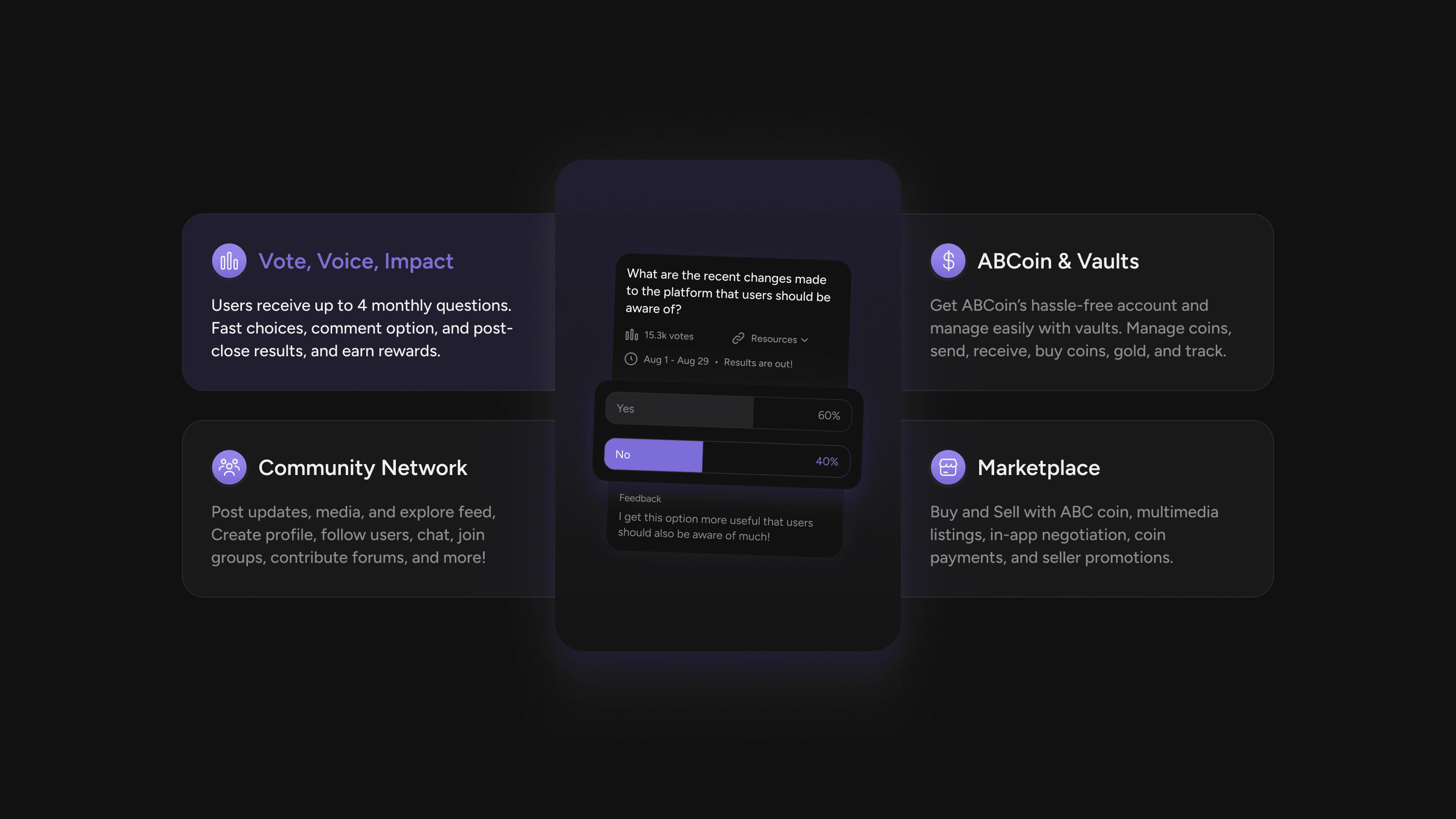
Communicate five distinct product modules (Wallet, Vault, Community, Marketplace, Voting) without overwhelming visitors
Establish premium credibility while remaining approachable to everyday users

Design Decisions
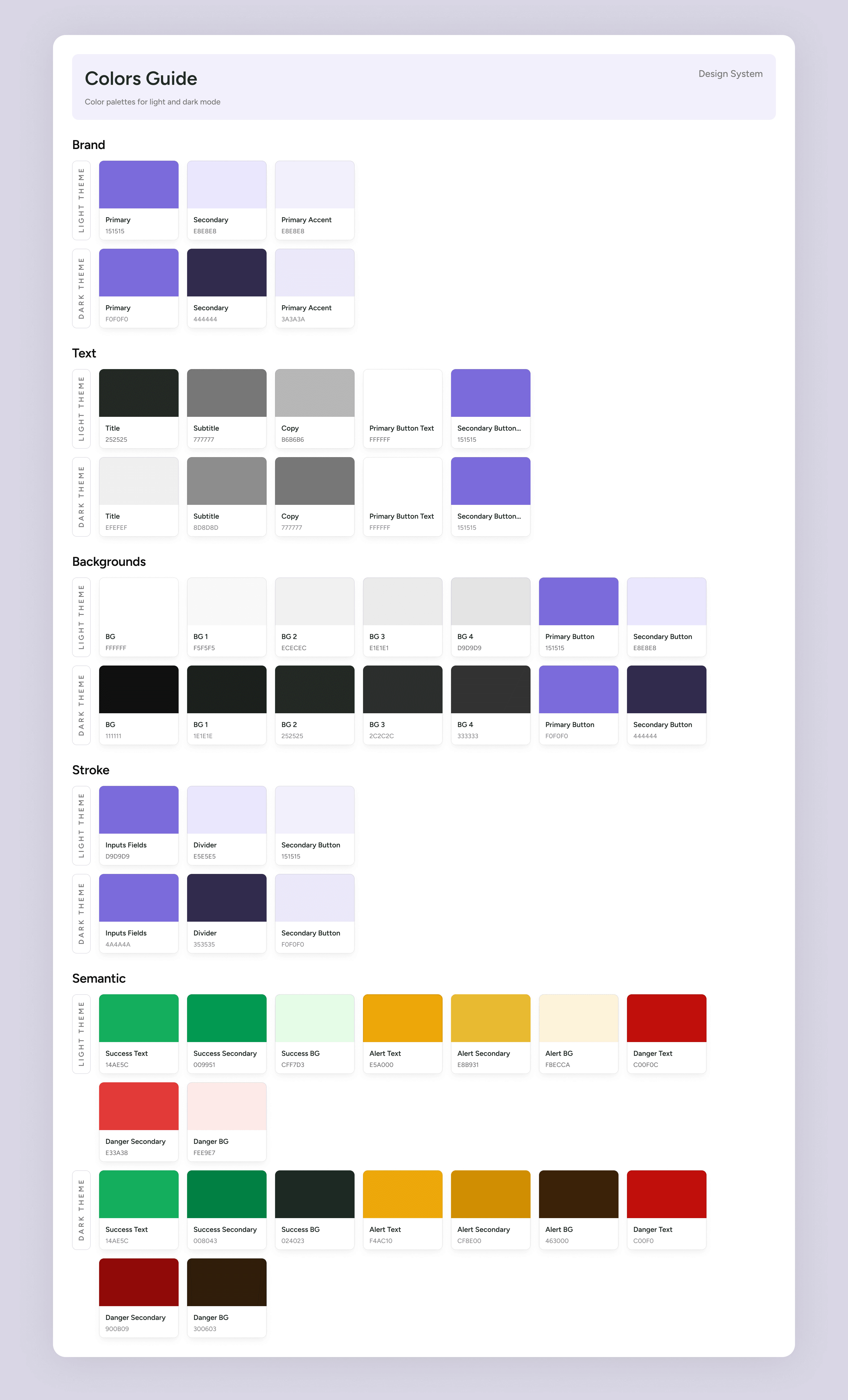
Visual Identity — Confident Calm
A soft violet/lavender palette replaces typical fintech greens and reds, signaling premium value and calm reliability. are minimal, keeping focus on the gold-backed core without feeling like a commodity pitch.
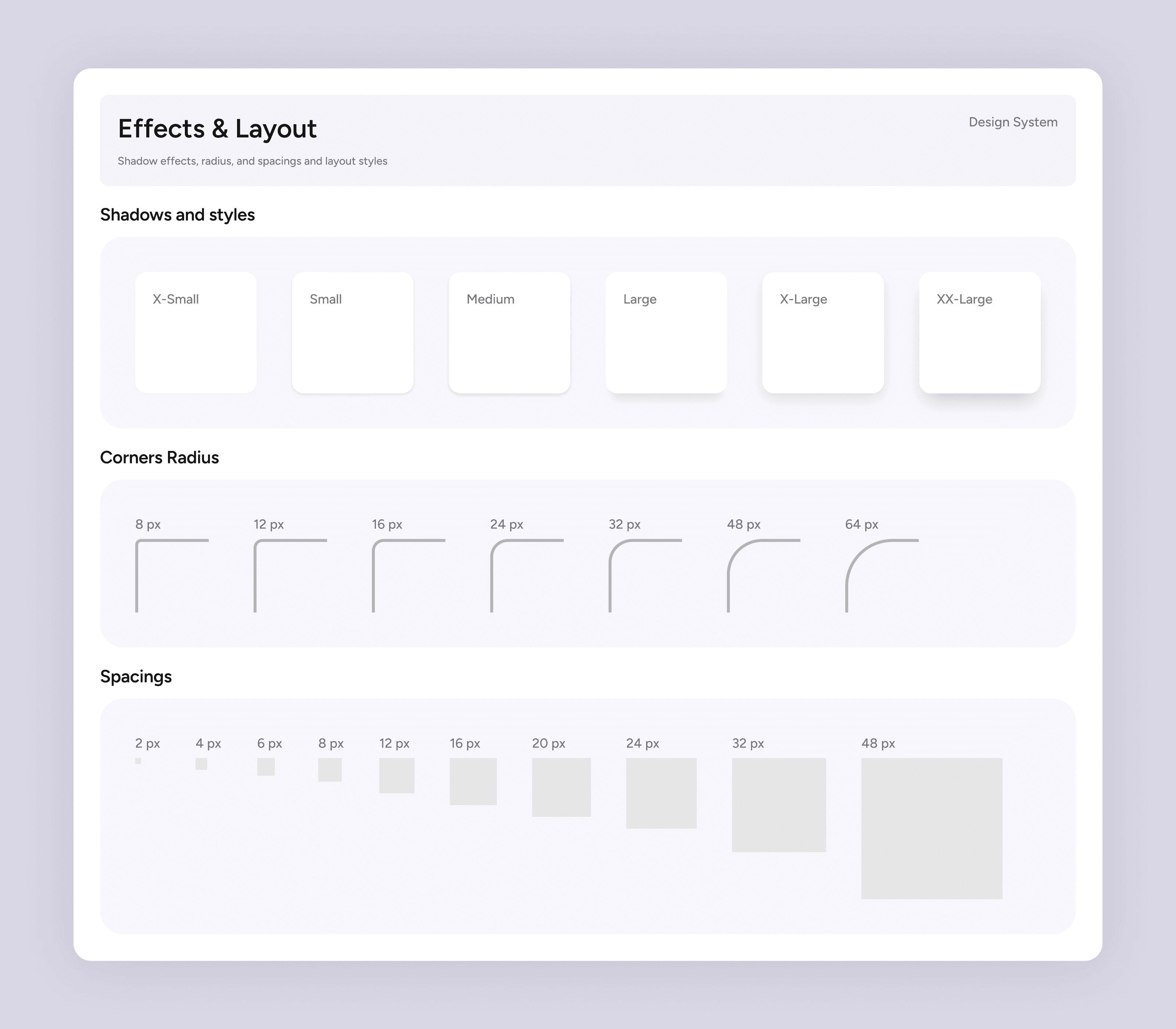
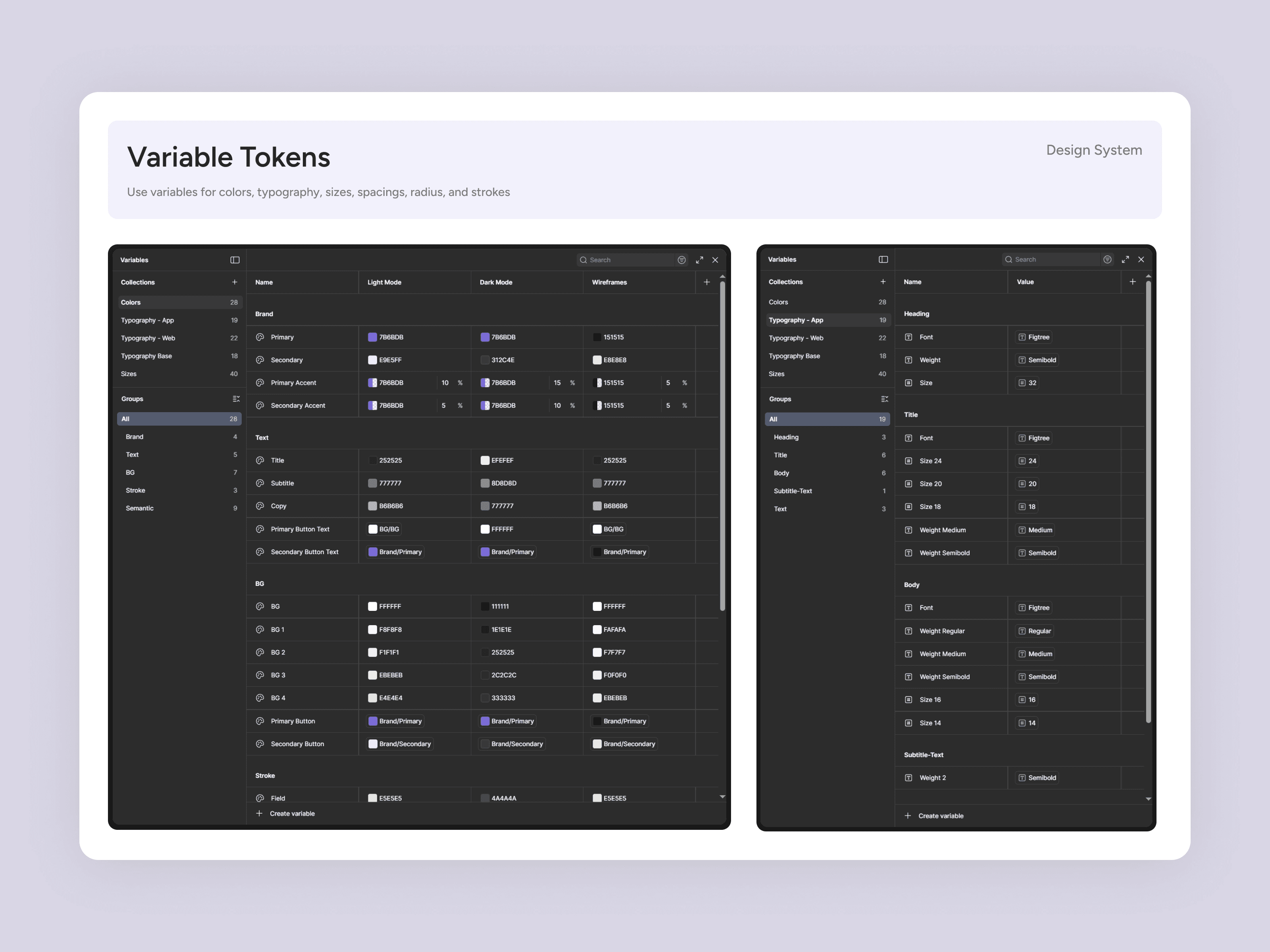
Design System
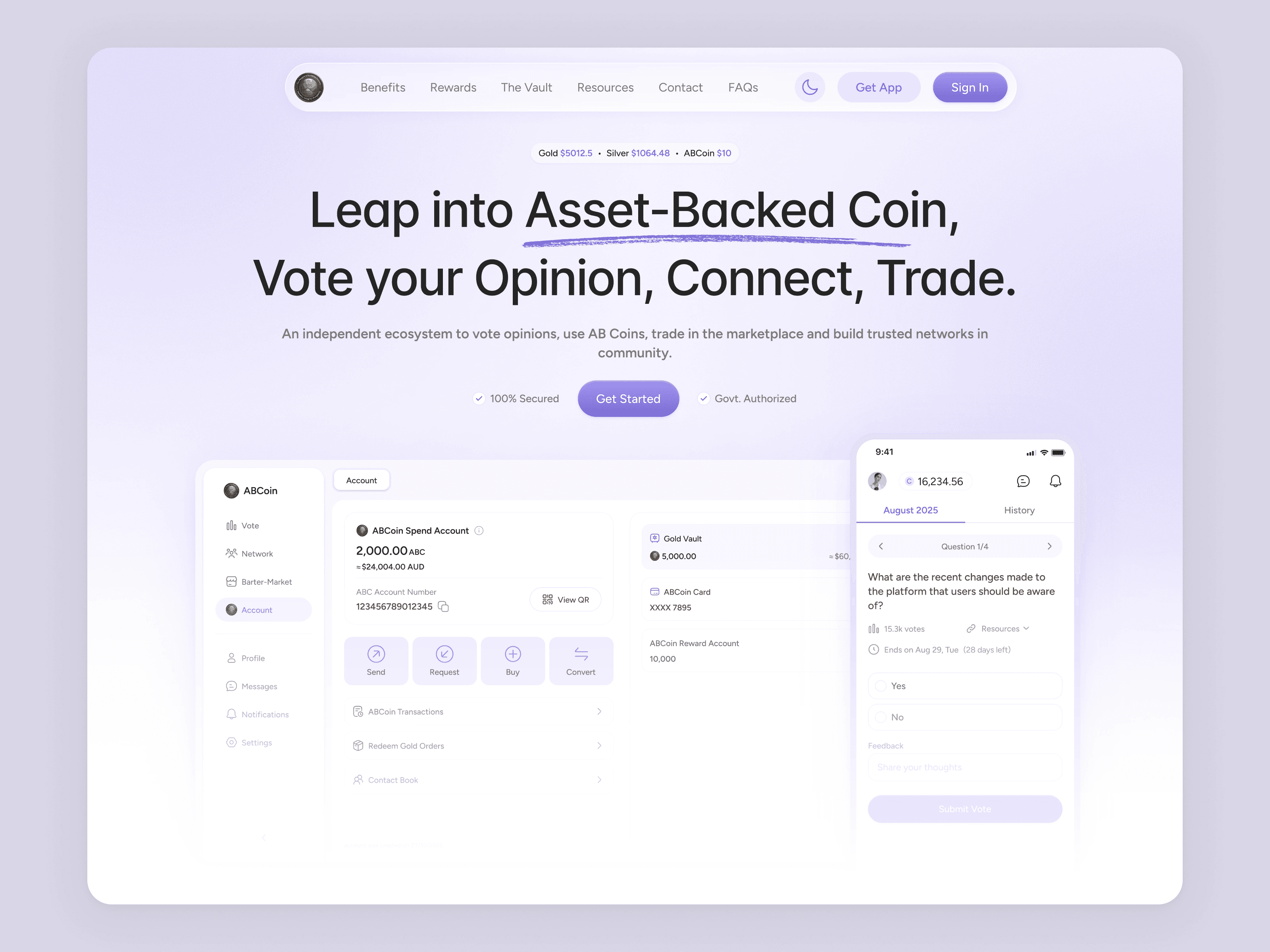
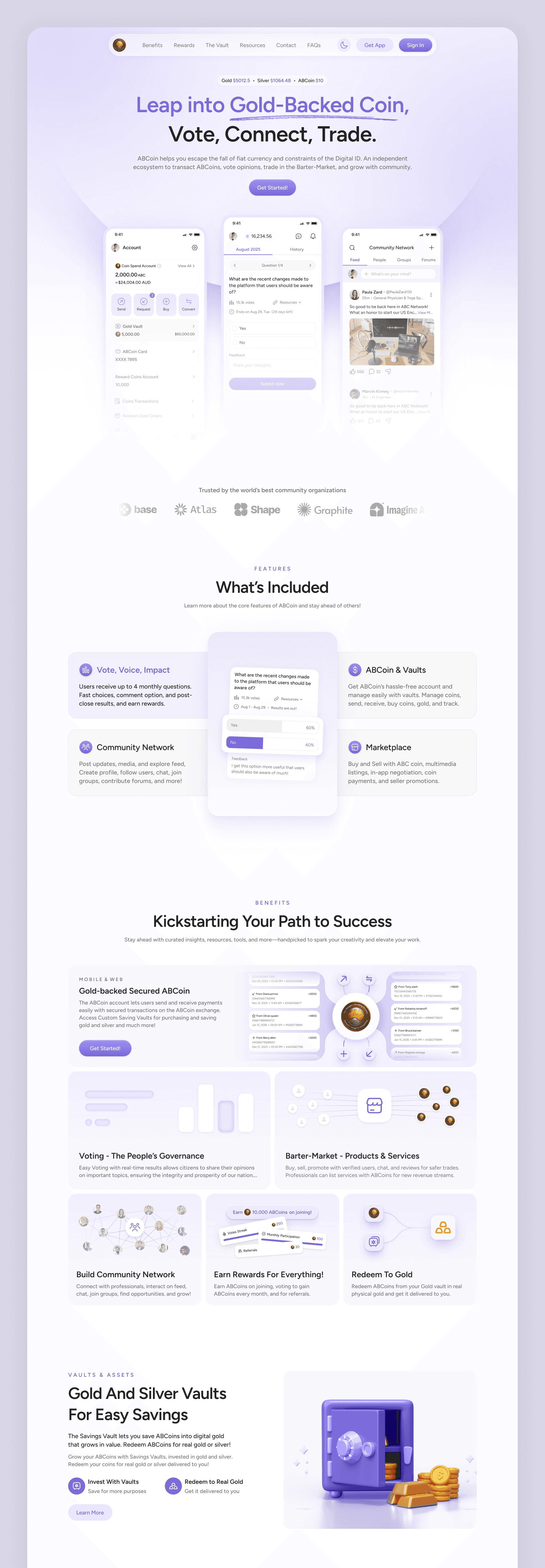
Hero Section — Clarity First
"Leap into Gold-Backed Coin, Vote, Connect, Trade" leads with the emotional promises: security, community, action. Tight supporting copy sets the problem-solution frame, while above-the-fold phone mockups make the product instantly legible.
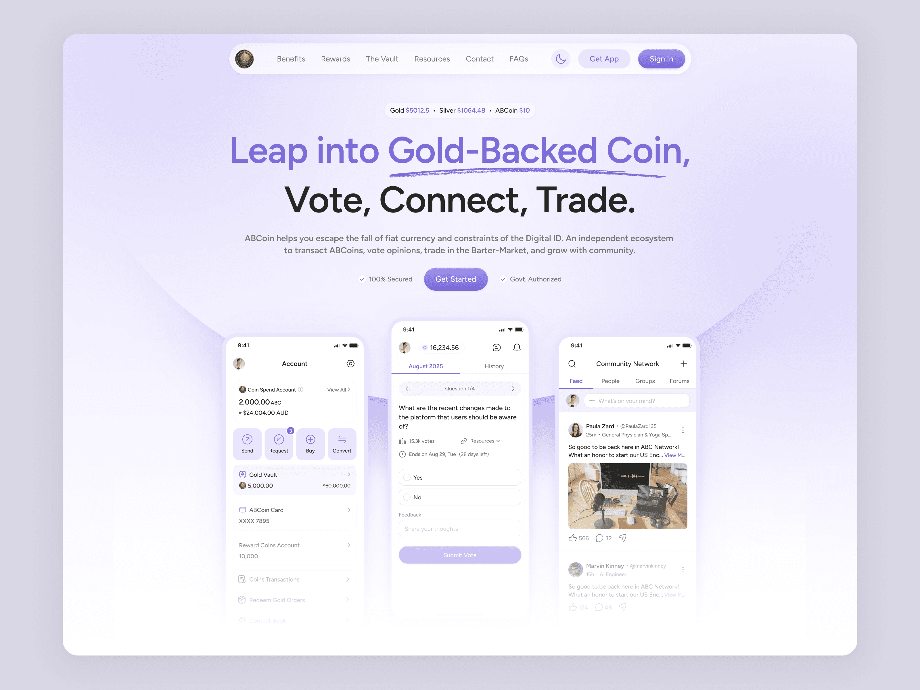
Features Architecture — Modular Storytelling
Features unfold as a guided scroll, not a grid. Sections like "What's Included," "Kickstarting Your Path to Success," and "Gold Vaults" build understanding in sequence, earning trust step by step.

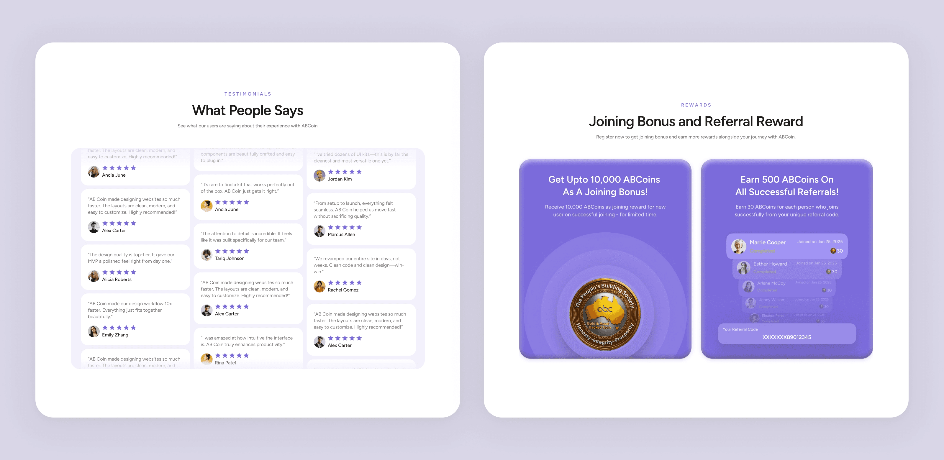
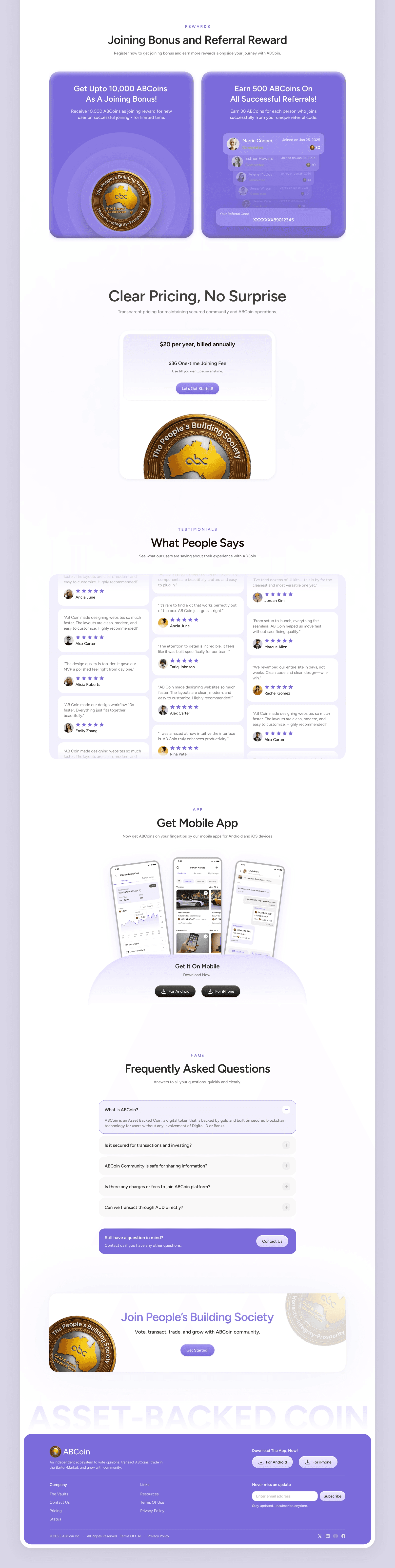
Social Proof & Gamification — Reducing Friction
A mid-page Joining Bonus and Referral Reward turn interest into participation before pricing. Testimonials in card layouts add human credibility ahead of the final CTA.
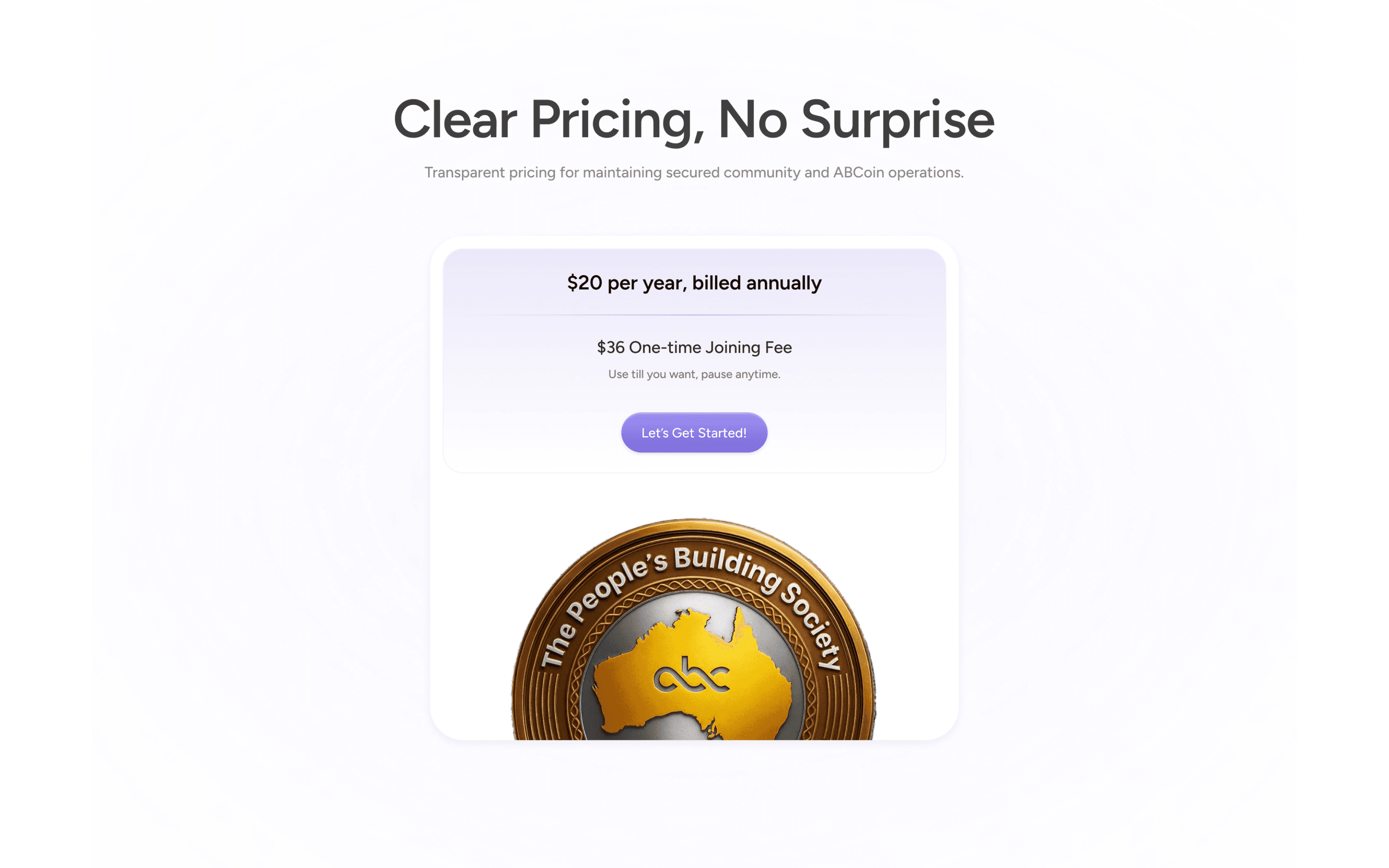
Pricing Section — Radical Transparency
"Clear Pricing, No Surprise" uses a minimal layout and a single clear price to counter hidden-fee skepticism and reinforce honesty.
Mobile App CTA — Meeting Users Where They Are
A three-phone spread reinforces a mobile-first product for daily use, with lighter visual weight once conviction has been established.

Full Landing Page - Light Mode
UX Outcomes
Design Goal | Solution Applied |
|---|---|
Build trust + transparency | Kept violet premium theme, real testimonials, and transparent pricing |
Explain all 5 modules clearly | Made a progressive narrative scroll and used custom graphic for features |
Drive sign-up conversion | Did strategic CTA placements, sequencing, and a gamified referral section |
Explain product utility | Shown wallet ↔ vault ↔ physical gold in simple and scannable chunks |
Establish community value | Equal visual weight given to social features alongside financial ones |
Retention engagement | Showcased community, marketplace, and voting as core retention hooks. |
Full Landing Page - Dark Mode


Key Takeaway
The ABCoin website works as it treats trust as a design material.
Every section, the color, the copy, and the custom graphics are all built to reduce doubt before it introduces a feature. The result is a page that doesn't just explain ABCoin. It makes you want to be part of it.


